What is a Climate Model?
A climate model is not CO2 concentration, nor is it Galactic Cosmic Rays or even the changes in the sun’s cycle. It is an entire but simplified reconstruction of the climate to make it easier to predict the future climate. A climate model attempts to incorporate as many of the natural processes that have an effect on the climate.The Community Climate System Model (CCSM version 3) incorporates a very large number of variables and each variable is accompanied by a large database of numerical values that is constantly updated and fed into the computer. There is so much information that only a supercomputer can run the model. This diagram illustrates the variables that are included in a full climate model. But the picture is only part of the story.
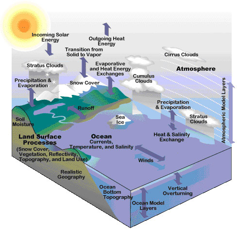 (From Windows to the Universe, at http://windows2universe.org/ from the National Earth Science Teachers Association (NESTA).)
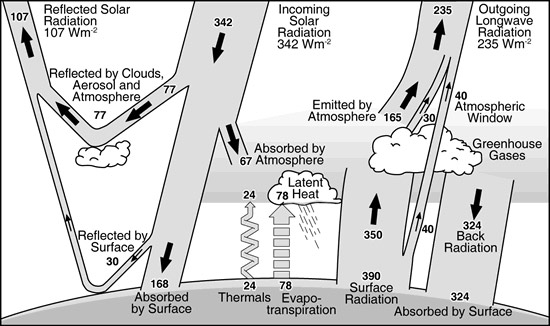
To use these models numerical values that represent energy inputs and outflows are estimated by measuring the amounts of energy coming from each source, such as the sun or reflections from clouds or blackbody radiation back to space from the surface of the Earth. So each temperature, each measurement of the cloud cover, the light from the sun – all these must be translated into a single unit of measurement. The common unit often used is energy expressed as watts per meter squared (Wm2). The next diagram (also from http://windows2universe.org/ the National Earth Science Teachers Association (NESTA)) gives an example of an energy budget based on the variables depicted in the climate model.
This energy budget is a “balanced budget.” That is, the amount of energy coming into the Earth is exactly balanced by the amount of energy leaving the Earth. The Earth itself is a source of heat, but in terms of describing a model, because it is so constant and unvarying a source, that source of energy is not included in the model – it would not change anything if it were in or out. It would just add unnecessary calculations. The main source of energy that creates heat in the atmosphere is from the sun, and importantly it is variable. That variation provides most of the variation in our climates over long periods of time. However, it certainly does not account for all the variation in climate. The amount of cloud cover partly regulates the amount of energy sent back to space and in the case of high clouds (cirrus) the amount of heat reflected and trapped. The reflectivity or albedo of the earth’s surface is important. White snow and ice reflect more heat back to space than the green carpet of a forest. Some of the incoming heat is absorbed by the greenhouse gases and never reaches the Earth.
The ocean warms and cools more slowly than the atmosphere, so the heat content of the ocean is also an important measure to use when gauging the longer-term changes to the warming or cooling climate.
In the current debate over climate changes, the arguments are really about the balance. Does the variation in the sun’s energy overwhelm all the other variations? Does the amount of cloud cover make the most difference? Does the concentration of greenhouse gases primarily control the variations?
Well the answer, of course, is that they all make a difference. There is after all only one climate here on Earth, so why are there different models that come up with different answers? Because all models are simplifications, judgements must be made about which variables are important. The usual way to do this is winnow out the variables that do not vary the same way the observed climate varies. Usually the final judgements are made from a statistical analysis of the amount of energy coming and going for each variable. Some of those statistical estimates are based on laboratory experiments such as the effect of CO2 as a greenhouse gas. Some are based on indirect evidence such as temperatures in the geological past. Most are pretty good, but a few of the most critical have interlocking feedback mechanisms, for example the amount of water vapour the air will hold rises with temperature. In this case if temperature is increased by the concentration of CO2 (a greenhouse gas), the added water vapour (an even more potent greenhouse gas) increases the effect of the CO2. This is called a feedback mechanism.
If it were not for the presence of greenhouse gases in the atmosphere the Earth would be exceptionally cold, cold enough that not many animals or plants could survive on the surface and all of the surface water would be frozen solid. So the amount and concentration of the various greenhouse gases makes a huge difference.
Similarly the amount of heat reflected back into space from low clouds is extremely important. The entire world notices the difference when a huge volcanic eruption occurs spreading a cloud over large regions of the Earth. So anything that causes cloud cover to increase can cool the Earth. If cloud cover is decreased the Earth tends to warm because the reflection of energy by clouds is no longer as strong.
Finally, the big source of energy is the sun. So it stands to reason that large variation in the sun’s activities will make a difference to our climate. The solar variation is both periodic (regular predictable changes) and aperiodic (unpredictable changes). The most obvious periodic change is the 11 year cycle of sunspot activity. This is very regular and essentially stays within a predictable range over time. These have some effect, but not much (less than 1.5 Wm2). The Earth does not maintain a constant distance from the sun. This also causes periodic variations in the amount of energy reaching the Earth from the sun – the so-called Milankovitch cycle – and these can cause a great deal of change in the atmospheric temperatures because the amount of solar radiation reaching Earth can vary as much as 25% in the full Milankovitch cycle. Both of these are predictable. One interesting time in the past (called the Maunder Minimum) occurred during an extended period when there was very little sunspot activity. There is some debate over whether this actually caused the “little Ice Age” but it was at roughly the same time.
So What is Causing the Change in the Climate?
It’s a Hoax
A few people have been arguing there is no change, that it is all a big hoax. That may be true but it is not a very useful pronouncement. It would imply that all of the temperature measurements for the last 150 years are either fake or that they have been secretly adjusted to make it look like the temperature is rising. As a scientist in a completely different field, I find this the least likely explanation. Herding scientists is really much more difficult that trying to herd cats – I know because I was in charge of managing a large group of scientists and they (rightly) insisted on their academic freedom.
It’s the Sun
Of all of these major sources of heating and cooling, the sun is the most predictable and it can be directly measured. These measurements clearly show that there is no trend in variation of the solar radiation that would explain the current observed trend of increased temperatures (see the chart below). So it is not likely the amount of solar variation just now.
It’s Greenhouse Gases
The most widely accepted just now is the effect of greenhouse gases. Recalling the diagram, greenhouse gases are responsible for a very large proportion of the heat that stays on the Earth. The amounts of each type of gas has been pretty constant for as long as direct measurements have been possible, with one major exception and several minor exceptions. The major exception is CO2, but methane (CH4) and chlorofluorocarbons (CFCs) are also on the rise. Actually CFCs are slowing down because of the treaty to control the ozone hole. They are still used illegally, but with continued control CFCs should be under control. Why are they rising? They are rising because the climate cycle is unable to absorb all the extra gases that human activity such as burning fossil fuels adds to the atmosphere. The climate cycle and its subset the carbon cycle can handle about 25% of what we are adding yearly, but that’s all, so it is accumulating in the atmosphere.
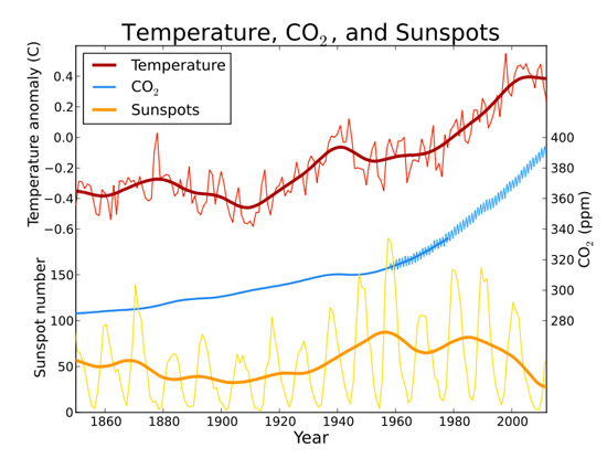 Data Sources: (light blue) Law Dome CO2 Data: ftp://ftp.ncdc.noaa.gov/pub/data/paleo/icecore/antarctica/law/law_co2.txt. (blue) Mauna Loa CO2 data:http://www.esrl.noaa.gov/gmd/ccgg/trends/co2_mm_mlo.dat. (red) Temperature Data: http://www.cru.uea.ac.uk/cru/data/temperature/hadcrut3gl.txt. (orange) Sunspot data:http://sidc.oma.be/DATA/yearssn.dat
So does this mean CO2 and the other greenhouse gases are responsible for warming the planet’s atmosphere? The chart shows no real relationship between the recent solar activity and the changing temperature. On the other hand the chart does show a pretty good relationship between rising CO2 levels and temperature.
However relationships do not necessarily show cause and effect. Here is one I particularly like. The hemline indicator. According to this relationship, if the hemlines go up so will the stock market. Care to try it? Or how about the other way around, let’s legislate short skirts so the market is forced to rise. If this is a real cause and effect relationship, it should work, but …
So while a close relationship is highly suggestive, it is only when you manipulate the situation or predict a result in the future that the relationship can be tested to see whether there is a cause and effect involved. If you find that the prediction (or the manipulation) retains its close relationship, this makes it much more certain to be a cause and effect relationship. In the absence of a prediction, however, the confidence you have in a co-relation should remain fairly low.
The current models of climate change that are considered by the Intergovernmental Panel of Climate Change (IPCC) all make predictions. The IPCC has grouped these as scenarios rather than actual predictions because it is difficult to know what changes will occur in the future that might affect greenhouse gas emissions (population growth, replacement of fossil fuels, etc.). The definitions of the scenarios are found here .
All the scenarios predict a temperature rise. The amount of rise varies, as does the projection of consequences that accompany the temperature changes over time. In the diagram, the four scenarios are shown with coloured lines. The shaded colours surrounding each line are “confidence limits” – a statistical measure of variation in the data. The grey bars are more interesting. They describe the likely range of the scenarios. For example, the bottom of each bar represents the most likely minimum temperature rise, and the upper limit of the bar represents the most likely maximum rise of temperature. The solid bar in the middle of each represents the modeller’s best estimate of what would actually be observed if the assumptions about what people will do in the future hold true for that particular scenario. This makes it especially easy to test the models. At least within the current range of testing (from 2000 onwards for this model) the model seems to be underestimating the temperature rise on a year after year basis. However for climate periods in the range of 15 to 30 years are probably more suitable. If this were a matter that had no real consequences, such as estimating the number of angels that can dance on the head of a pin, we could wait and see. If the IPCC summary of the modelling is correct, and CO2 accumulation is the culprit, the need for immediate action is clear. CO2 stays in the atmosphere for centuries and would continue to add temperature levels over that period.
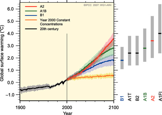 (from: IPCC Fourth Assessment Report: Climate Change 2007)
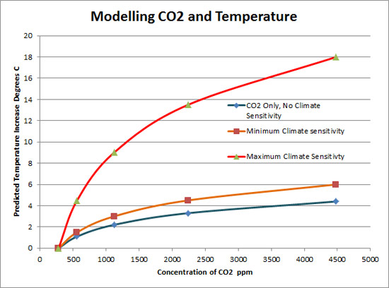
Estimating the correct climate sensitivity (the amount of climate feedback to the CO2) is especially important. The ability of CO2 to trap heat is an exponential function (often plotted ion logarithmic scales for easier interpretation as straight lines) in which a doubling of the concentration of CO2 raises the temperature a fixed amount (experimentally about 1.1C). In climate models estimates of the effect of feedback on the actual temperature rise is called climate sensitivity. The IPCC models use anywhere from about 1.5C to 4.5C as the estimated climate sensitivity – hence the different projections shown in the chart.
The estimates of climate sensitivity are critical in making strategic decisions by governments. In this chart, the concentration of CO2 begins at pre-industrial levels and ends at the maximum observed in the geological past. If there were no feedback and it was CO2 all by itself the maximum temperature rise would be about 4.4C. If the minimum estimated climate sensitivity is correct, then the maximum additional temperature would be about 6C. Finally if the maximum climate sensitivity is correct the temperature could soar well above what we humans could easily tolerate and would probably melt all of the world ice. Is any of this likely? Only time will tell for sure, but at least according to the long-term temperature trends, something is happening.
It’s Clouds Caused by Galactic Cosmic Rays
That sounds really exotic and far out, but the scientist who is recently adding weight to the concept has made some significant discoveries. The most significant new information is that the bombardment by protons, simulating Galactic Cosmic Rays (GCR) of clean air in a cloud chamber causes the formation of tiny particles. These are very small, only 2 or 3 nanometers (nm) across. But they were clearly present and the experiment has been repeated in the more formal cloud chamber at CERN the internationally funded and operated research facility. There is no known mechanism for these small particles to grow to the size needed to form clouds (50nm), but there is at least one possibility — GCR bombardment also enhances the formation of sulfuric acid in the atmosphere, a common precursor to clumping of particles. So in the words of Svensmark, the Danish scientist who found the GCR nucleation, “it appears” that there “seems to be” a solution to how the nuclei may grow enough to form clouds.
The essence of his idea is that in high periods of GCR bombardment on the Earth, clouds will form at a greater than normal rate and will cool the Earth. By contrast when local GCR bombardment is reduced, the formation of clouds is normal and the Earth’s atmosphere will react to the normal surrounding climate energy budget. Svensmark suggests that the most important climate modifier is cloud formation by GCRs. To back up his ideas, he has investigated a number of co-relations with past climate changes and a series of statistical treatments to attempt to estimate local Earth GCR over the past 500 million years. Some of these are very sophisticated treatments and rely on unproven assumptions about the source of GCR and rate of GCR at the Earth’s lower atmosphere. Nonetheless, the fit is sometimes quite good. This is an intriguing idea and while it is still in the stage of co-relations rather than a working model, the idea is highly suggestive of an additional factor in the climate models.
He has not yet made any predictions, has not formulated a climate model, and has not suggested a formula for integrating his ideas into a climate model. It will be most interesting if and when he does so because then the model can be tested in parallel with other climate models.
Simplistic analyses that match the reconstructed (from 1850 to 1950) and then measured GCR (since about 1950) with the observed temperatures are a remarkably good fit until the 1980s, then they stop matching and go in opposite directions.
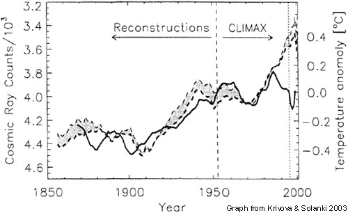 (from Laut 2003, J. Atmos. & Solar-Terrestrial Physics 65:801-812)
In addition, if we look at the co-relationship between measured cloud anomalies and the amount of cosmic ray variation (both as percent), the fit is not bad up until about 1993. From then on the trends diverge widely.
 (from Krivova and Solanki 2003 J. Geophysical Res. (108, 1200, 8pp.)
This does not necessarily detract from Svensmark’s ideas. It may simply be that CO2 is currently a greater energy trap than the cooling effect of the added clouds under current GCR rates. Or it may also be that until Svensmark suggests how to integrate his ideas into a formal climate model, there is no real way to test them as a reliable predictor of the future climate.
So What’s Next?
There are essentially two projections that actually predict the future atmospheric temperatures. One is based on the sun, and that suggests that we are headed for a cooling spell that could be a “little ice age.” The other is based on excess CO2 and similar greenhouse gases emitted by human activities and that one predicts a temperature rise in future years. If we use Svensmark’s work, even though we do not have an actual prediction, it would potentially add a cooling effect. Although he has not made a scientific prediction, he has spoken in public to suggest that the world will be looking at a cooling period in the near future (although in the absence of a Svensmarkian model we don’t know how near that future might be).
The fact that there are two different trends predicted or suggested, one warming and one cooling means that the differences will show up more quickly. Testing the two models by personal observation (not just scientific) should be easily possible in the next 5 to ten years based on this divergence of predicted effects. Just to summarize, here is a modified diagram of the energy budget to illustrate where each of the variables currently thought to be influential on the climate have their effect.
So in reality there really is only one real climate and one climate model. However there are different estimates of the effects of key variables in the model that make a big difference to the future “real” climate.
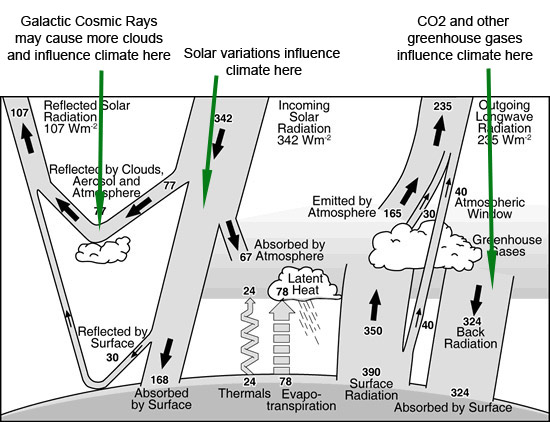 Modified from the original diagram at http://windows2universe.org/ the National Earth Science Teachers Association (NESTA)
The Emission Scenarios of the IPCC Special Report on Emission Scenarios (SRES)
A1. The A1 storyline and scenario family describes a future world of very rapid economic growth, global population that peaks in mid-century and declines thereafter, and the rapid introduction of new and more efficient technologies. Major underlying themes are convergence among regions, capacity building and increased cultural and social interactions, with a substantial reduction in regional differences in per capita income. The A1 scenario family develops into three groups that describe alternative directions of technological change in the energy system. The three A1 groups are distinguished by their technological emphasis: fossil-intensive (A1FI), non-fossil energy sources (A1T) or a balance across all sources (A1B) (where balanced is defined as not relying too heavily on one particular energy source, on the assumption that similar improvement rates apply to all energy supply and end use technologies).
A2. The A2 storyline and scenario family describes a very heterogeneous world. The underlying theme is self-reliance and preservation of local identities. Fertility patterns across regions converge very slowly, which results in continuously increasing population. Economic development is primarily regionally oriented and per capita economic growth and technological change more fragmented and slower than other storylines.
B1. The B1 storyline and scenario family describes a convergent world with the same global population, that peaks in mid-century and declines thereafter, as in the A1 storyline, but with rapid change in economic structures toward a service and information economy, with reductions in material intensity and the introduction of clean and resource-efficient technologies. The emphasis is on global solutions to economic, social and environmental sustainability, including improved equity, but without additional climate initiatives.
B2. The B2 storyline and scenario family describes a world in which the emphasis is on local solutions to economic, social and environmental sustainability. It is a world with continuously increasing global population, at a rate lower than A2, intermediate levels of economic development, and less rapid and more diverse technological change than in the B1 and A1 storylines. While the scenario is also oriented towards environmental protection and social equity, it focuses on local and regional levels.
An illustrative scenario was chosen for each of the six scenario groups A1B, A1FI, A1T, A2, B1 and B2. All should be considered equally sound.
The SRES scenarios do not include additional climate initiatives, which means that no scenarios are included that explicitly assume implementation of the United Nations Framework Convention on Climate Change or the emissions targets of the Kyoto Protocol.

